
Balance Points
The app strives to balance detailed tracking with a simple, approachable interface. This balance is crucial for encouraging consistent use, preventing users from feeling overwhelmed by the data entry process.
Harmony Elements
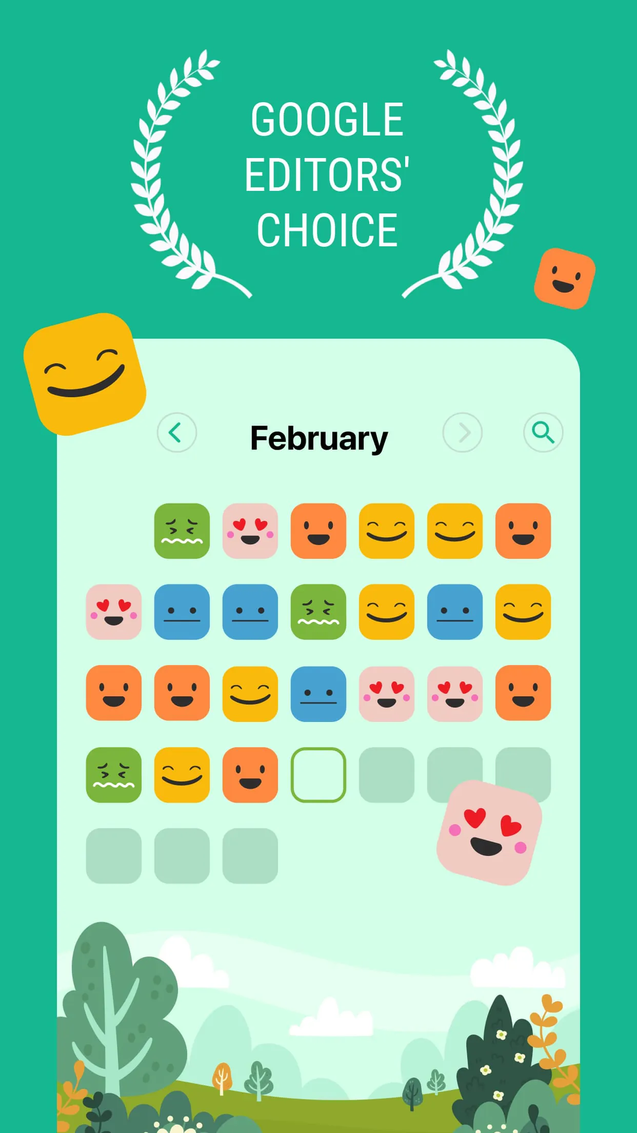
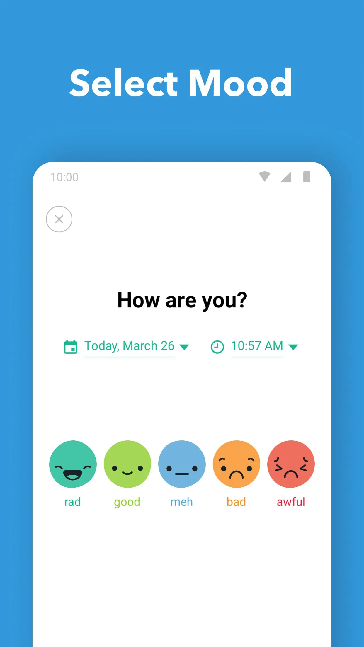
One element of harmony is the app's use of visual cues and simple iconography. Instead of relying on complex charts or graphs initially, the app uses color-coded mood faces. This makes it easy to quickly log your mood and identify trends without requiring advanced data analysis skills.
Integration Success
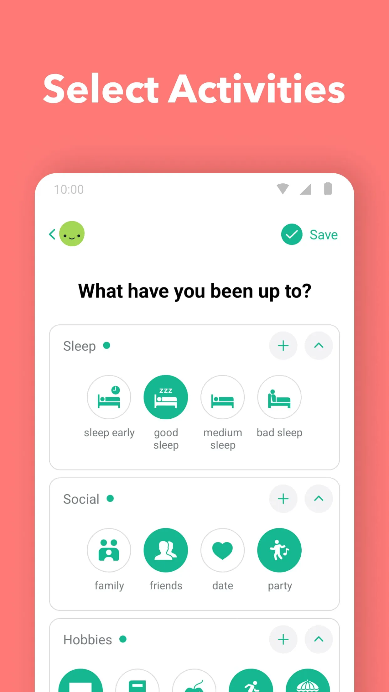
The successful integration lies in its customization options without sacrificing ease of use. Users can create custom moods, activities, and categories, which tailors the app to their specific needs. However, the setup process remains intuitive. The app smoothly integrates into daily life by sending optional reminders.
User-Tech Synergy
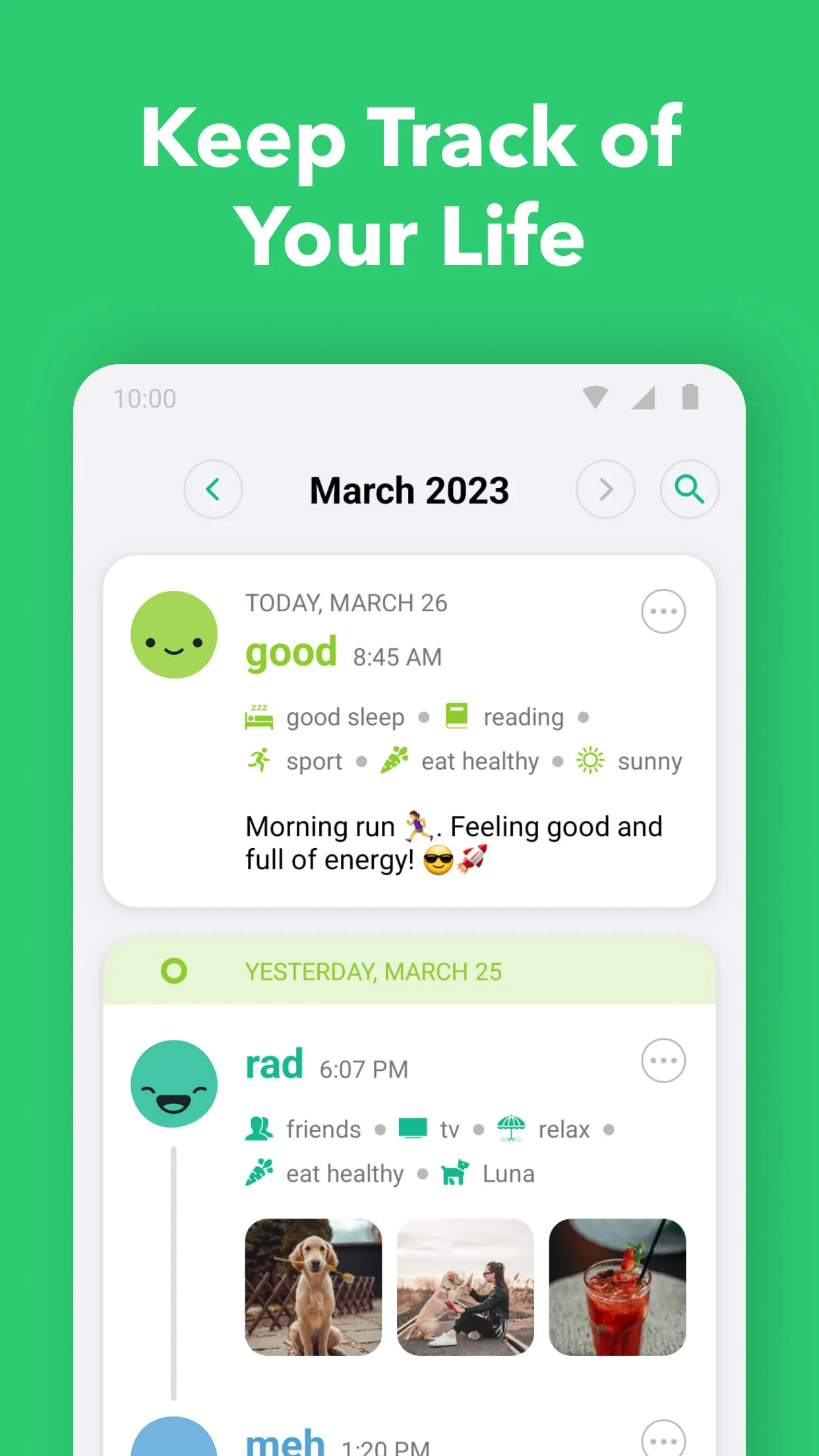
The app's user-tech synergy shines through its ability to provide valuable insights without demanding extensive user input. By logging moods and activities, the app can identify patterns and correlations, helping users understand the factors influencing their emotional well-being. The data visualization further strengthens this synergy.
Perfect Proportions
The app's perfect proportions are exemplified by its feature set. It offers the essential tools for mood tracking and journaling without becoming bloated with unnecessary add-ons. This focus keeps the app lightweight and responsive, contributing to a positive user experience. The limited features also allow for less consumption of battery power.
- Simple and intuitive interface
- Customizable mood and activity tracking
- Valuable insights into emotional well-being
- Limited advanced data analysis features
- Reliance on self-reporting can introduce bias
Overall Impression
The app successfully balances functionality and usability, making it a valuable tool for anyone looking to improve their emotional awareness.